Web Style Guide
style points
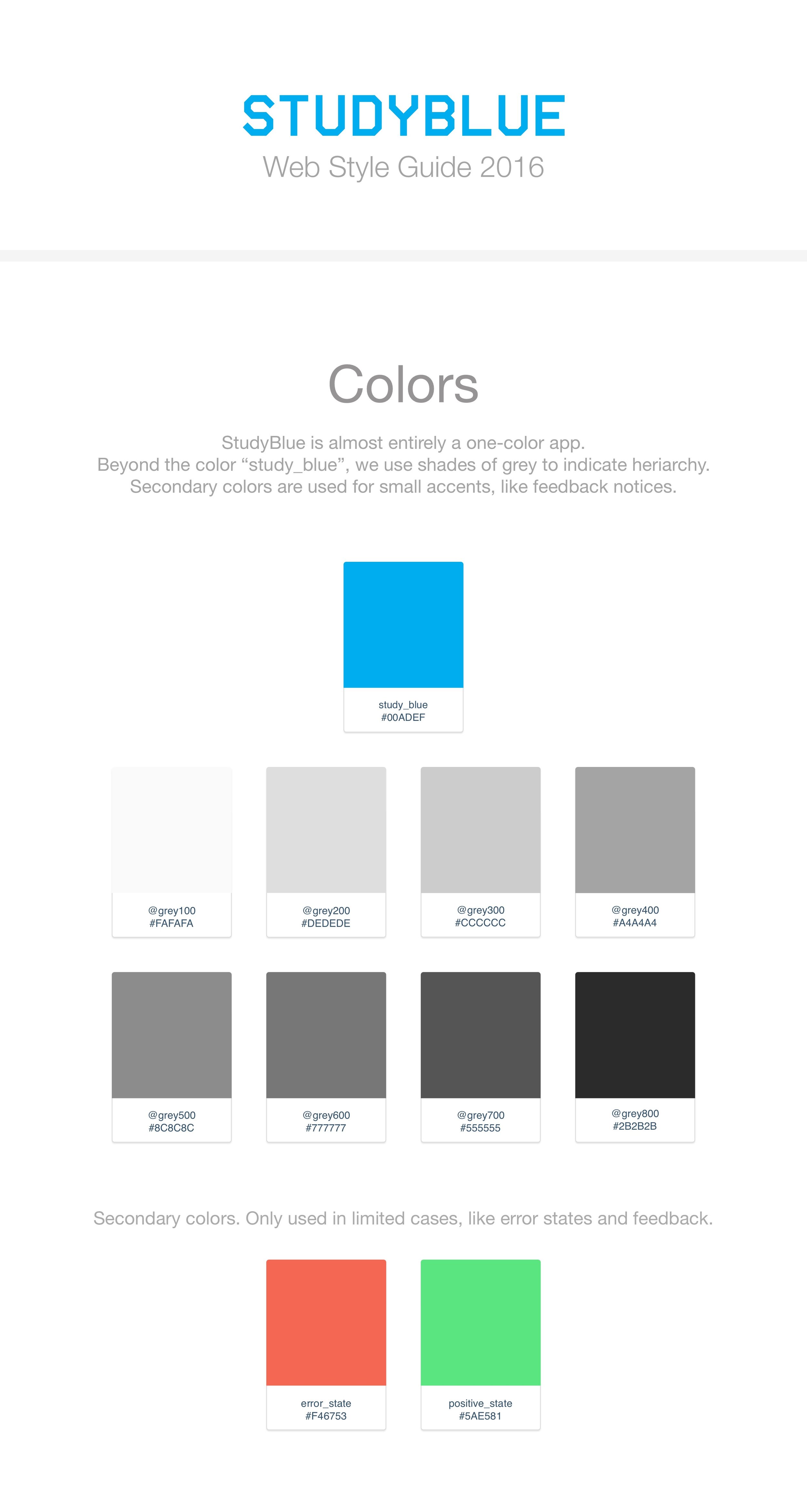
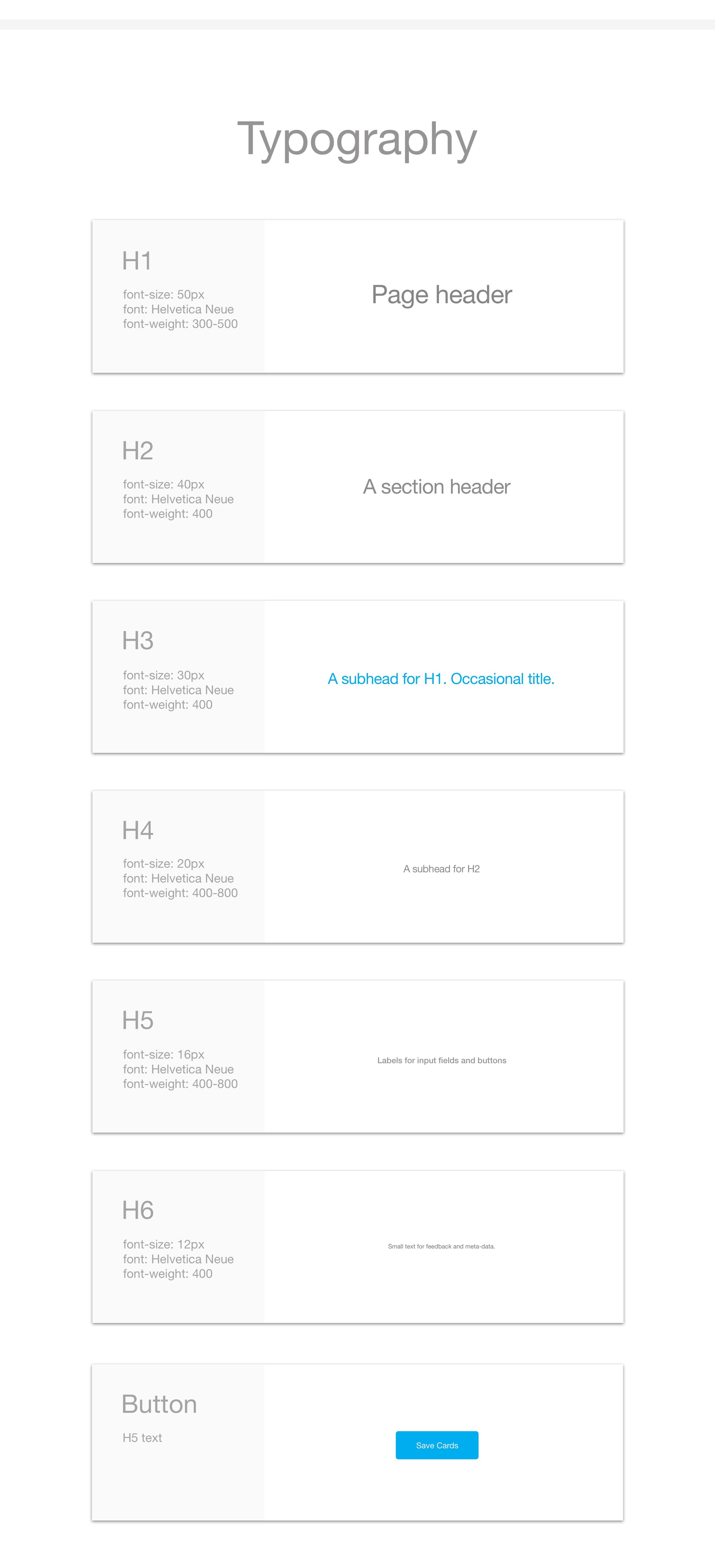
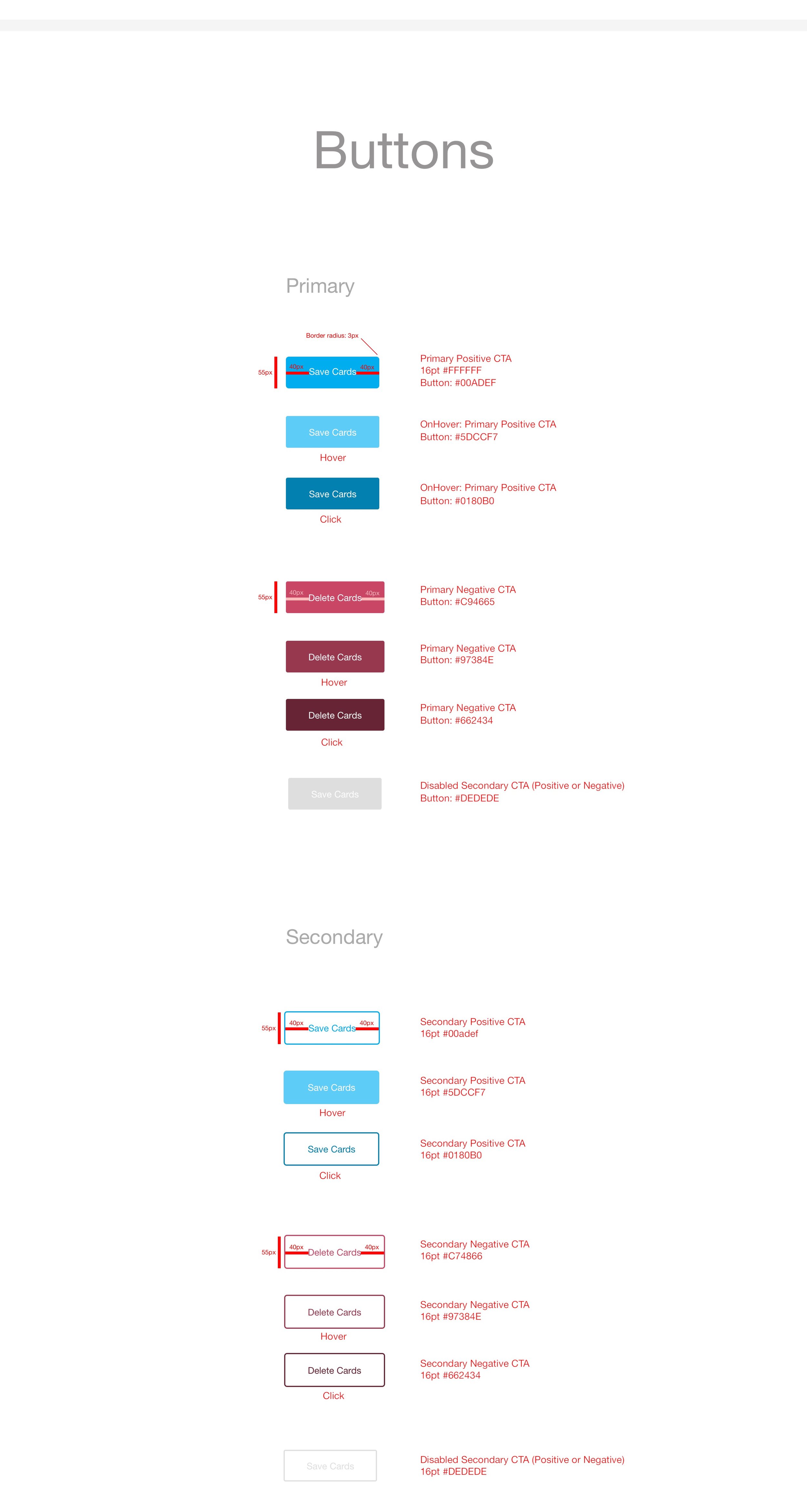
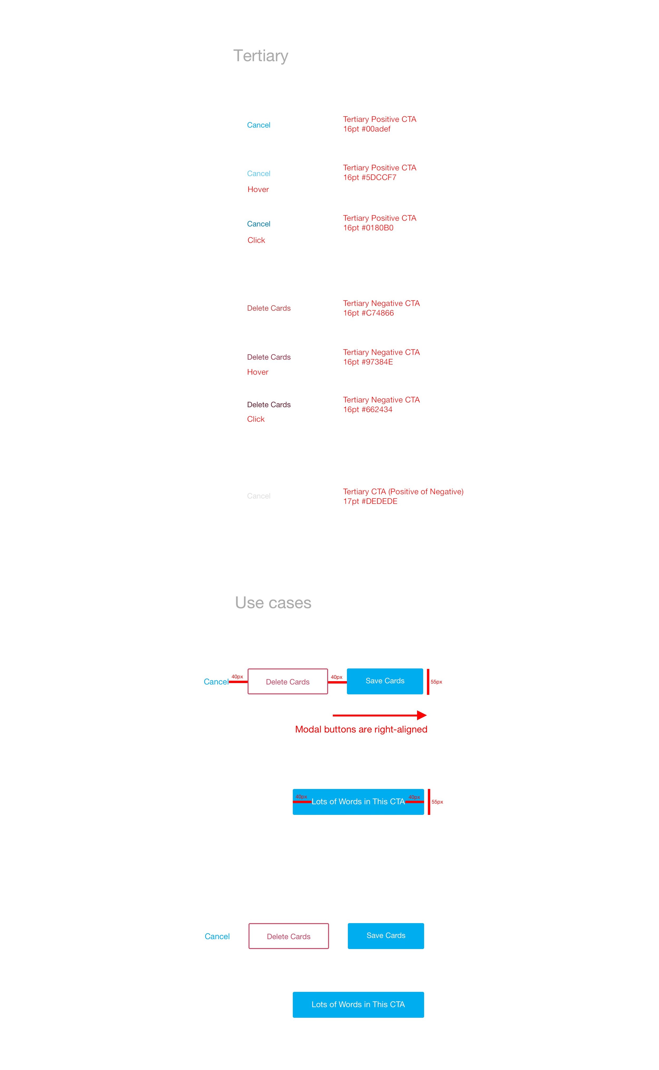
As StudyBlue experienced success and began to grow, we realized that we would need a formal style guide. We had been operating on a set of general principles, but had not codified them because they were still in flux. I sat down to lay out our basic styles, but left the floor open for other designers (or anyone with a strong point) to modify the guide.
Eventually I transitioned into a mobile focus, so I handed this over to the web team. They turned it into a living style guide, made of code snippets that are routinely updated. This has improved their workflow and saved many hours.
If I were to create this again, I would avoid mid-tone greys. They are difficult to work with from an accessibility standpoint, especially with typography. I would also define the shades, rather than just setting down the primary tones. After I created it, I went to a talk and met Nathan A. Curtis, who really improved my understanding of design systems.


