Mobile Recommended Cards
“‘Recommended Cards’ is a powerful feature on our web product that helps students painlessly create study decks. I was tasked with designing the mobile version.”
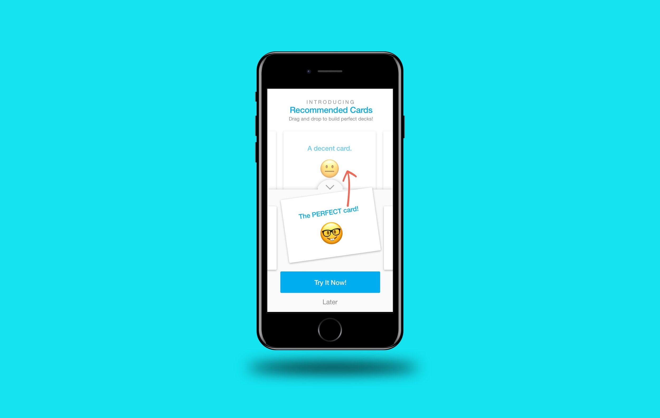
Internal prototype demo, part of the final deliverables.
recreate a compex web feature on mobile
StudyBlue’s value proposition is “Less stress, more time, better grades.”
They have 350+ million flashcards in their database, which affords a feature called Recommended Cards. As you make a new deck of flashcards to study, the database can actually feed you pre-made cards based on the topic you indicate, helping you to quickly expand your study materials.
For example – type in “mitosis” and you will see a list of cards, complete with definitions and diagrams, ready to drop into your deck.
The web platform included StudyBlue's powerful Recommended Cards feature.
Unfortunately, that feature only existed on the web platform, so I was tasked with expanding it into our iOS and Android platforms. The physical constraints of mobile devices made it difficult to implement such a powerful feature, so the final version reflects a thorough process of iterating and testing.
Final ‘Recommended Cards’ prototype, recalibrated for the mobile platform. Animation is slowed for demo purposes.
the main challenges
The first challenge had to do with displaying recommendations. As an assistive feature, it could not disorient users, or take them away from their primary purpose. If we covered the entire page with recommendations, obscuring their work, that would be too invasive. Even though it was powerful, it had to feel lightweight. The most elegant solution came from concealing the recommendations beneath the keyboard. Since they wouldn’t be typing at the time they were using a pre-made card, it made sense to swap the keyboard and recommendations.
“As an assistive feature, it could not disorient users, or take them away from their primary purpose.”
The next challenge was afford students a way to actually use a recommendation. First, I tried putting buttons on the cards themselves, but they obscured the content. After a few experiments, I eventually settled on a button that straddled two segments. I looped engineers in at this point and kept them updated periodically to make sure I was staying sane.
Early iterations of the mobile Recommended Cards feature
Another major challenge was finding a place from which to trigger the feature. I had recently redesigned the flashcard editor, so adding another button anywhere was a big deal. Keeping as much symmetry as possible to avoid the sensation of clutter, I placed the trigger button in the middle of the card as an "i" for information icon. That presented a few problems. What should the button icon really look like? What if a user scrolls downward, will the button disappear?
“This iteration presented a few problems. What should the button look like? What if a user scrolls, will the button disappear?”
From the Project: Working out details for the mobile Recommended Cards affordance, along with interactions
core functionality
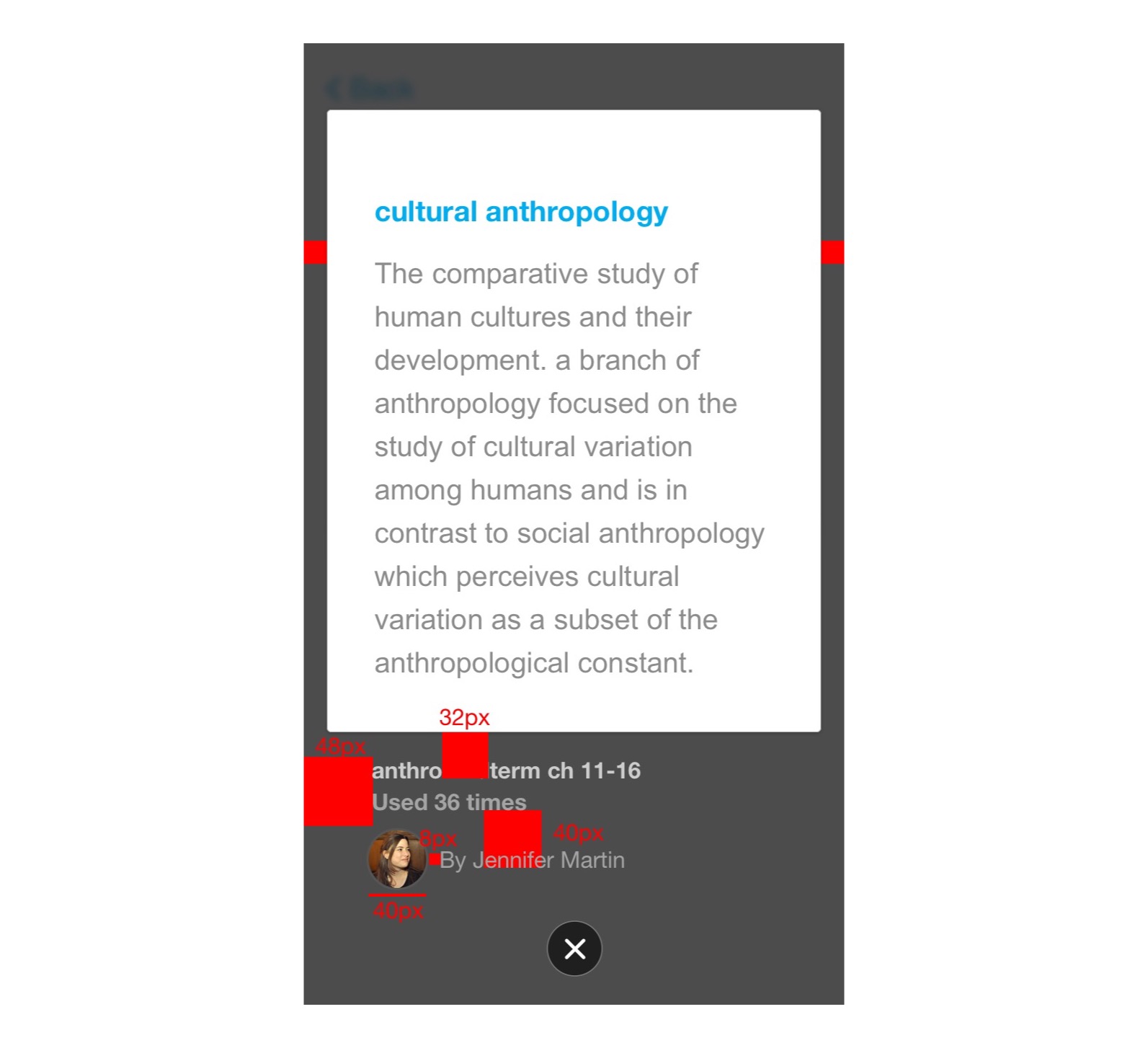
From there I spent time developing the core interactions. How would users navigate the recommendations? Would they be able to swipe to other cards in their deck while the recommendations were showing? What if they wanted to experiment, but then undo their work? Meta-data also needed a treatment. Lots of details needed to be worked out.
From the Project: Establishing rules for swiping interactions in the mobile Recommended Cards feature
From the Project: Experimenting with a meta-data treatment for the mobile Recommended Cards feature
From the Project: Working out details of an Undo affordance for the mobile Recommended Cards feature
Testing and iteration
At this point I created a basic prototype and guerrilla tested with friends and coffee shop studiers. After watching people interact with it, I noticed that most of them tried to drag a card up from the recommendations. Since that was their natural behavior, I restructured the feature around it, eliminating the straddling button. Users could now drag and drop, which seemed to be the most intuitive interaction for them.
“Since that was their natural behavior, I restructured the feature around it...”
Incorporating user-test feedback into the designs for mobile Recommended Cards
Drag-and-drop functionality based on user feedback for the mobile Recommended Cards project
Since I no longer had a button straddling the two screen segments, I experimented with treating the recommendations as a skeuomorphic “tray”, partially concealed beneath the keyboard. Users could drag the tray up to see recommendations. That eliminated the need for a trigger button, which was another tentative win. No more obnoxious center button, but would it make the affordance too obscure for people to discover?
At the time, I could find little industry-precedent for a design pattern like that. It was not an easy decision to make. But that choice was later validated, as more apps began using it – like Evernote’s text editor, Apple maps, and Google maps. Engineers said that the drag-and-drop interaction was going to be a challenge, but not insurmountable.
“At the time, I could find little industry-precedent for a design pattern like that. It was not an easy decision to make.”
I intentionally made the affordance a little chunky, a little bit in the way. Since this pattern was rare at the time, I wanted to make sure it was usable even if the user was drunk and riding a jostling bus. Which, given that we targeted a college demographic, wasn’t out of the question. Later on, once users had gotten used to the pattern, we would reduce the real estate of the down-arrow to show more content.
“I wanted to make sure it was usable even if the user was drunk and riding a jostling bus. Which, given that we targeted a college demographic, wasn’t out of the question.”
When the design was ready, I coded a high-fidelity native iOS prototype in Swift, recorded a video demonstration, and delivered those along with a jpeg map of the feature.
I coded a native prototype of the mobile Recommended Cards feature
Feature map for mobile Recommended Cards
The demo you saw at the top of this page was part of the final deliverables package. Included again here to show the full package together.
lessons
Executing the project was difficult. I had just redesigned the flashcard editor, which had not yet shipped, and the new interactions depended on it. So it was essentially two projects in one. iOS and Android each tackled half and then taught each other the lessons learned for the second half. The drag-and-drop functionality proved to be the most difficult. There were surprisingly few libraries to support the style we needed.
I helped with QA in terms of visuals and interaction, making sure the design was as accurate as we could reasonably expect given our resources.
Helping with visual QA as engineers executed the new designs
We were single-threaded (one engineer each) in both mobile platforms at the time, and in retrospect it would have been good to take our limited resources into account as a design constraint. That being said, both teams were excited for the challenge. They also both expanded later and executed the full project.
I am proud of the project, as I think it represents a big leap forward for StudyBlue’s users, affording them a tool that is not available in any other mainstream app (as of 2017.)


