Mobile Homework Help
“With an accumulated 350+ million study materials, why not just ask the system questions?”
Design a large new feature for mobile
One of StudyBlue’s most ambitious features is called HomeWork Help. It allows students to ask questions and receive answers in the form of repeatable study materials.
I assisted the web team in designing the new feature for our core product line, and then proceeded to design the mobile version. It was a huge undertaking that had been talked about for years, so definitely a fun project. Below, you can see the results of a late-stage prototype that I coded in Swift.
A late-stage prototype of the new Homework Help feature for mobile.
Here's a little story all about how...
The first challenge was deciding how to expand the mobile app. We already had a robust product, and this new tool could qualify as feature bloat if we weren’t careful. I am always wary of turning any product into a remote control.
“So we could not roll it out as another new global tab – it had to integrate seamlessly into the existing product.”
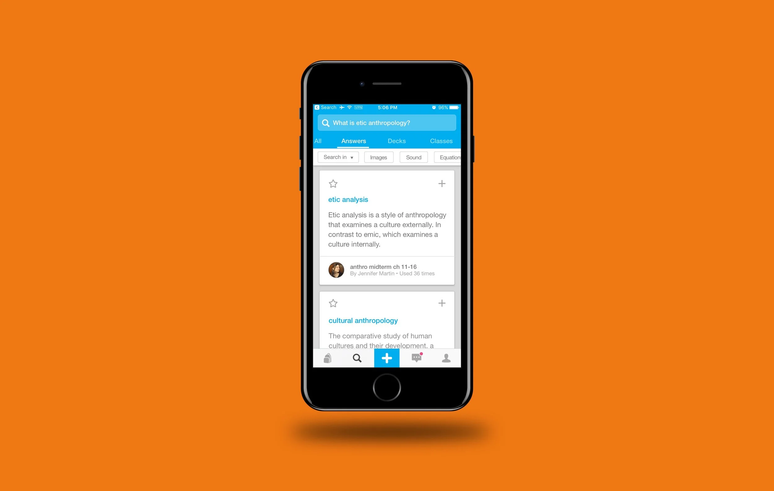
My colleagues and I dissected the feature and looked at it from every angle, which led to a paradigm shift. Although we had been thinking of it as a new feature, it was also possible to frame it as a granular search tool that filled a gap in our current capability. With the current search experience, users could find decks, classes, people, etc. But they could not search for individual cards. Homework Help would solve that.
The original search experience displayed all content as one massive string of results. And users could not find individual cards. The Homework Help feature led to a full Search redesign.
So I targeted the Search tab as Homework Help’s new residence, but that brought new challenges. In order to integrate it, I would have to redesign the whole search experience. If we simply bolted on a new chunk of UI, there would be glaring inconsistencies, so it all had to get rebooted at once.
“A good solution came from Material design patterns.”
Using Material's app bar (along with a Android's former “action bar”) pattern, I broke out the different search categories into tabs, and housed them at the top. Then I set to work designing the look of each section, using an 8px grid also pulled from Material. The result was a highly consistent, clean experience that extended through every tab.
an extra challenge
One major challenge lay in the affordances for Homework Help results. Once a user found the right flashcards, what could they do with them? Obviously, they should be able to add those to a deck.
But the web platform had also incorporated a sidebar to save cards, called “notes.” It would be weird to suddenly lose access to your notes just because you switched to your phone, so we needed to incorporate that as well.
“But the web platform had also incorporated a sidebar to save cards into, called ‘notes.’”
The web version of Homework Help, complete with a "notes" sidebar.
I experimented with a few solutions to quickly display notes during a mobile search. One of my favorites (see gif below) was based on this tutorial. But none of the attempts formed a true solution alongside the other design constrains. Finally, based on suggestions from my colleagues, I placed the notes section into the Home tab. Although it would not be as closely tied to the search experience, users would have immediate access to it when they opened the app.
“I experimented with a few solutions to quickly display notes during a search.”
An early attempt at keeping the "notes" section close at hand in the Homework Help mobile experience. (The "Your Notes" tab at the top represents a separate solution, condensed into one scratchpad design.)
From there, I worked out other details, like the possibility of an “All” category.
I also coded a native prototype in Swift which helped the engineers see exactly what I was talking about, while allowing me to fine-tune nuances of the experience. I particularly enjoyed solving for how to search by author.
I coded a native prototype in Swift. Though it was not part of the final deliverables, it helped tremendously in the design process.
polishing up
I combed through for visual polish after that, mostly to improve typographic hierarchy and refine the grid I had used. Lots of tiny changes. We reigned in the scope as well. The initial designs had modified global navigation, but my PM reviewed it and judged that those changes would need to take place in another project.
Execution
Execution is ongoing, with iOS leading the charge. Since it is a conveniently modular project, PM’s broke it out into discreet phases, and I structured the design deliverables around those.
Although I had created a prototype earlier in the process, the faster-moving static designs had changed enough that I did not include it as part of the deliverable package. I had used industry-standard patterns for the most part, so engineers could execute without it. (Searching by author/textbook would require a demo and gif when they got to that phase.)
Final Thoughts
An area of improvement for this project would have been to test it more. Although I did stick to common patterns, there are certainly unknown unknowns hiding in the weeds.
I’m proud of this one. The scope was vast, touching probably 25% of the mobile product. Users will be able to get what they need more easily, and move on with their lives. I established typographic, spacing, and architectural precedents that will become new standards for our product. Those will facilitate high quality designs in the future, allowing StudyBlue to run even faster.

